Data Analysis
There are number of issues that could cause model inaccuracies. For instance, data can be overrepresented in some cases or underrepresented in others. Not having a good balance of data can negatively skew a model’s performance. This leads to data biases causing the model not to be fair, inclusive, safe, or reliable. The Azure Responsible AI dashboard includes a Data Analysis section for users to be able to explore and understand the dataset distributions and statistics. It provides an interactive user interface (UI) to enable users to visualize datasets based on the predicted and actual outcomes, error groups, and specific features. As a result, the insights help ML professionals to better understand and pinpoint the root cause of errors.
In this lab, we will explore how to use the Data Analysis section of the Azure Responsible AI (RAI) dashboard to discover the root-cause of the model’s performance due to problematic data distribution.
The chart view of the dashboard is another useful tool to visualize the data representation. You will be using the chart to compare the data distribution for the patients data.
Check data imbalance issues
- Under the "Chart view" pane, use the cohort with all the test data by selecting the "All data" option from the "Select a dataset cohort to explore" drop-down menu.
- On the Y-axis, click on the current selected "race" button, which will launch a pop-up menu. Under "Select your axis value", choose "Count".
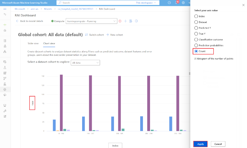
- On the X-axis, click on the current selected "Index" value, then choose "True Y" under the "Select your axis value" menu. You can see that the data distribution between both classes is imbalance.
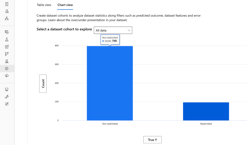
- Looks like out of the 994 diabetes patients test data, 798 patients are Not readmitted and 198 are Readmitted. These are the actual values or TrueY.
- On the X-axis, click on the current selected "Index" value, then choose "Predicted Y" under the "Select your axis value" menu.
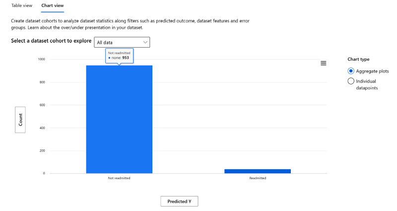
- You can see that the model’s number of patients Readmitted is 41, while the number of patients Not Readmitted is 953. So, this definitely exposes an extreme data imbalance issue where the model is not performing well for cases where patients are Readmitted.
Check sensitive data representation
It is important to check for data disparities for non-sensitive and sensitive data (e.g., age, gender, race etc.). Not having a good balance of data can negatively skew a model’s performance. This leads to data biases causing the model to have fairness, inclusiveness, safety, or reliability issues.
- On the Y-axis, verify that "Count" is still selected.
- On the X-axis, click on the current selected "Predicted Y" button, which will launch a pop-up menu. Under "Select your axis value", click on the "Dataset" radio button.
- Under the "Select feature" drop-down menu, select "race".
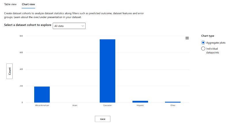
- You will find that, there's a lot of disparities among "Race" representation. Caucasians represent 77% of patients in the test data. African-Americans make up 19% of the patients. Hispanics represent 2% of the data. There's obviously a lot of gaps between the different races. This is an area that will be a good candidate for a data scientist or ML engineer to flagged to make sure it does not induce any racial biases.
- Next, on the X-axis, click on the current selected "Predicted Y" button, which will launch a pop-up menu. Under "Select your axis value", click on the "Dataset" radio button.
- Under the "Select feature" drop-down menu, select "gender".
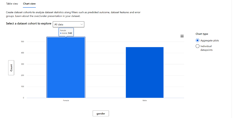
- The gender representation among the patient is fairly balanced. So, this is not an area of concern.
- Finally, On the X-axis, replace gender to age.
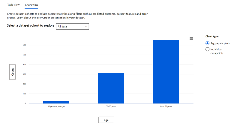
- The Age representation is not proportionately distributed across the 3 age groups. Diabetes tends to affect individuals the older they get. This may be an acceptable and expected disparity, however this is another candidate for a data scientist to validate with medical specialists.
Check Hospital Readmissions
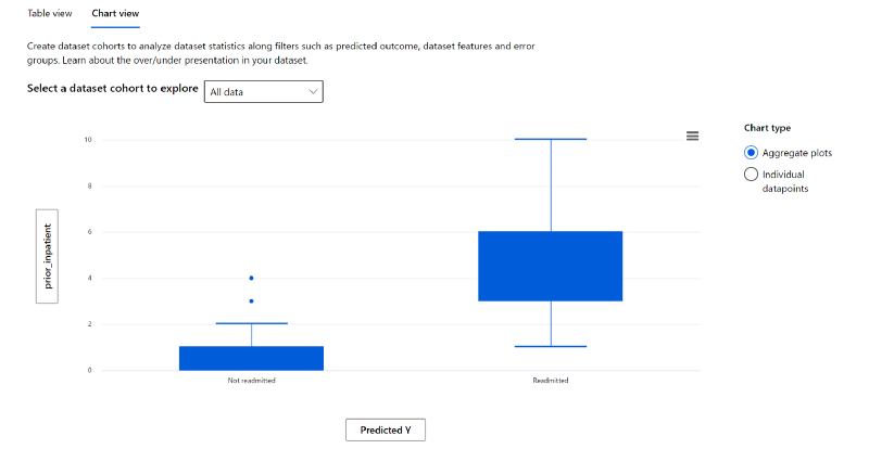
Since Prior_Inpatient is one of the features from the cohort will the highest errors; let see what impact it has to the model’s outcome.
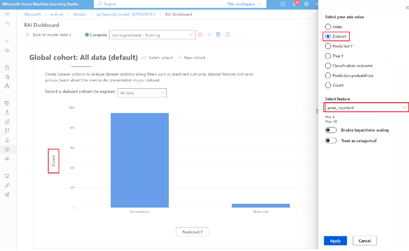
- Click on the y-axis label. In the pop-up window pane, select the "Dataset" radio button. Then under "select feature", select "prior_inpatient" on the drop-down menu.
- On the X-axis, click on the current selected "Index" value, then choose "Predicted Y" under the "Select your axis value" menu.
- As you can see, the chart shows that the more the number of inpatients hospital stays a diabetic patient has in the past, the more likely they will be readmitted back in the hospital in 30 days. Patients with less prior inpatients are more likely not to be readmitted.
- Click on the y-axis label. In the pop-up window pane, select the "Dataset" radio button. Then under "select feature", select "race" on the drop-down menu.
- Leave the X-axis to be "Predicted Y".
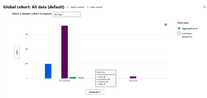
- For "Race", the chart shows that due to the data imbalance, the model will not be able to predict if a patient will be Readmitted back to the hospital for some ethnicities. As you saw above the "Caucasian" patients are overrepresented in this data set. So, even when there was no prediction for the other ethnic groups, we see 31 "Readmitted" occurrences for Caucasian patients since there's an overrepresentation there.
- Click on the y-axis label. In the pop-up window pane, select the "Dataset" radio button. Then under "select feature", select "age" on the drop-down menu.
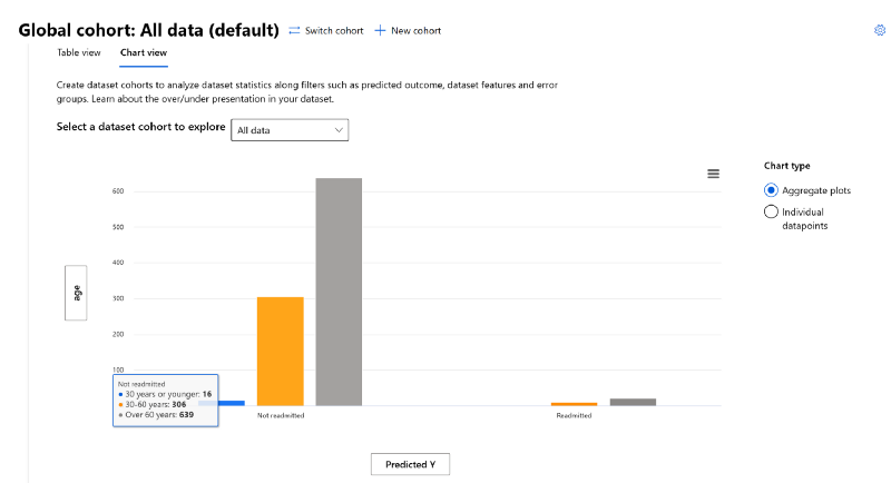
- You'll see that the model prediction is affected by the patients' age groups as well. There's an overrepresentation of data for patients "Over 60 years" and data underrepresentation for patients "30 years or younger". Here, the effects of data imbalance were evident between the model's classification of "Not readmitted" vs "Readmitted".
As you can see from all the data analysis we performed in this lab, data is a significant blind-spot that is often missed when evaluating model performance. After tuning a model, you can increase the performance but the does not mean you have a model that is fair and inclusive. A prime example was the patient's "Race" and "Age". Although the Race feature did not come up during our error analysis or model overview investigation, the Data Analysis section of the RAI dashboard exposed this discrepancy.
This also shows that in the data analysis process, there are gray areas where data scientists will need to work very closely with business stakeholders or decision makers to understand if the data represents reality or not.
DISCLAIMER: Microsoft products and services (1) are not designed, intended or made available as a medical device, and (2) are not designed or intended to be a substitute for professional medical advice, diagnosis, treatment, or judgment and should not be used to replace or as a substitute for professional medical advice, diagnosis, treatment, or judgment. Customers/partners are responsible for ensuring their solutions comply with applicable laws and regulations. Customers/partners also will need to thoroughly test and evaluate whether an AI tool is fit for purpose and identify and mitigate any risks or harms to end users associated with its use.